
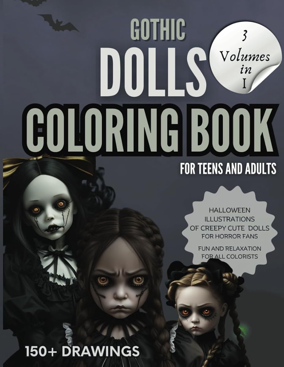
The first time you colour a gothic portrait, the temptation is to reach for black. Black hair, black dress, black background — it looks dramatic in the reference and then, twenty minutes later, the whole page has turned into a dark smudge with a face floating somewhere in the middle.
Gothic colouring works best when "dark" is a family of colours rather than a single pencil. Think aubergine, ink blue, moss, oxblood, charcoal and tarnished gold. Once you have that family, the page has depth without losing the drawing.
Build a small palette first
Before you colour a single shape, choose five to seven pencils and put the rest away. A workable gothic palette usually includes:
- Two darks — one cool (ink blue, charcoal) and one warm (oxblood, deep brown).
- Two mids — moss green, dusty plum or slate.
- One skin tone base — pale peach, warm grey or a desaturated pink.
- One accent — tarnished gold, rust or a jewel green for ribbons and eyes.
Limiting the palette does two things: it keeps the page cohesive, and it stops you from freezing in front of a hundred options. You can always add a sixth colour later.
Colour the eyes early
Faces are read eyes-first. If you leave the eyes until the end, you will spend the whole session colouring around an unfinished stare, and it becomes much harder to judge the values around them. Colour the iris and the shadow under the lid early, then let the face follow.
Leave a tiny white highlight uncoloured in each eye. It takes ten seconds and it is the difference between a portrait that looks alive and one that looks like a mask.
Skin is not one colour
Porcelain skin in a gothic illustration is usually cool and slightly green or grey, not orange. Start with a very light base, then add a second, cooler tone in the shadow areas: under the chin, beside the nose, around the eye sockets. Keep the lightest areas of the forehead and cheekbone untouched.
If the face starts to look flat, add a small amount of warm pink to the cheeks and the tip of the nose. If it starts to look sunburnt, stop. A little warmth goes a long way on a cool face.
Hair: build in layers, not blocks
Dark hair is where pages go wrong. Do not fill it with black first. Start with a mid-tone (dark brown, deep plum or navy), leave the drawn highlight lines empty, then add a darker tone only in the deepest recesses. Finish with a cool grey or blue pencil along the highlights to suggest shine.
The same logic applies to black fabric: use a dark blue-grey base, then deepen the folds, then add a single highlight along the edge. Pure black should be reserved for the smallest shadows, not the whole dress.
Work from the centre out
A reliable order for a portrait: eyes, skin, hair, clothing, then background. This keeps the focal point finished while the page is still easy to read, and it means the background can be simpler than you think. A soft wash of colour behind the figure is often enough; a fully rendered background competes with the face.
Keep some paper showing
In gothic work, contrast is everything. A page that is 100% covered in colour has no light left in it. Leave the brightest highlights as bare paper — the bridge of the nose, the top of a lip, a ribbon edge, a single strand of hair. Those gaps do the work that white gel pens try to do later.
Test colours on a scrap page
Gothic palettes are subtle, and pencils often look different on paper than they do in the tin. Keep a scrap sheet and lay down a small patch of each colour before committing. It takes two minutes and prevents most regrets.
Darkness is not a colour. It is a relationship between the shadow and the one small highlight you chose to leave alone.
If you want a place to practise, the Gothic Dolls series is built around faces, fabric and backgrounds that reward this approach. Start with Volume I, or take the jumbo 3-in-1 if you already know you love the series. And remember: the first portrait is a warm-up. The second is where it clicks.